Andy Baio recently wrote a post about a line chart that had accompanied some research from Netflix about the streaming video performance across various ISPs. The chart was ostensibly informative, but due to the colors that they chose for each line, it ended up being nearly useless for people with red-green colorblindness.
Andy went on to create a more colorblind-safe version of the chart, but what I found even more interesting is that he closed his post with an anecdote relating his interactions with the Snopes folks. (Snopes, if you’re not familiar with it, is a popular site that fact-checks various urban legends.) As it would happen, Snopes’ category pages—in which they summarize the “True” / “Not True” status of each item in that category—was making use of shades of red (“false”) and green (“true”) spheres that weren't all that accessible. In fact, for someone with red-green colorblindness (which affects around 5–8% of all men), the colors were virtually indistinguishable.
(Even if you may not be colorblind, this kind of thing can be easily tested with freely available software such as Color Oracle. If you install that, you can see this for yourself by loading any of Snopes’ index pages and selecting “Deuteranopia” from Color Oracle’s menu.)
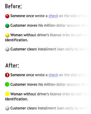
Andy went so far as to create some accessible versions of those color spheres (keeping them red and green, but mostly changing them to a different shade) and he offered them to the Snopes people with the hope that they might put those to use. The change would have made their site much more usable to persons with colorblindness while maintaining the site’s overall aesthetic. Oddly enough, they refused and decided, instead, to write a FAQ entry on the subject:
We chose our red-yellow-green coding system because its “traffic light” pattern can be understood by most of our readers with little or no explanation. While we understand that about 8% of our readership experiences some form of color blindness and therefore cannot distinguish the different colors of bullets, other alternatives we have tried have proved confusing to many of our non-color blind readers. Therefore, we have chosen to stick with a system that works very well for 92% of our readers.
If we take a closer look at the numbers relating to colorblindness, that 5–8% means that between 1 in 20 and 1 in 12 men will have difficulty using Snopes.com. By way of analogy, around 1.6 million Americans use wheelchairs. While that may be ½% of the US population, the public has every expectation that businesses will help accommodate persons with wheelchairs through the use of wheelchair ramps and the like. And rightly so. (It’s also the law.) Whether one’s eyes, limbs, or other parts of one’s body, disabilities can affect all of us. That’s why I was so astounded when I learned that the people behind Snopes had no interest in the assistance that was offered to them.
After giving it some thought, I decided to see if I could help fix this. So, after first checking with Andy to ask whether I could make use of the revised images that he had created, I wrote up a Userstyle for Stylish to automagically replace Snopes’ inaccessible images with Andy’s improved versions.
If you’re not familiar with the Stylish, you can think of it along the lines of Greasemonkey but for CSS. Put another way, Stylish can automagically insert CSS into a page whenever you visit a particular site. It’s available for both Firefox and Chrome.
Installing the Userstyle for Firefox or Chrome
First, you’ll need to install Stylish (and then restart your browser):
- Stylish for Firefox. (If you’re using the Firefox 4 betas, you’ll need to scroll down the page to the “Beta Channel” heading to load the beta version of Stylish.)
- Stylish for Chrome.
Once you have Stylish installed, the only remaining step is to visit the page for the Snopes Colorblindness Accessibility userstyle and click the “Install with Stylish” button.
Installing the Userstyle for Safari
If you’re using Safari, you’re not entirely out of luck. Though there isn’t an official port of Stylish for Safari, there is another extension that can be used in its place:
First, you’ll need to install the User CSS extension (which is basically a clone of Stylish).
Then, once you’ve restarted your browser, you should see a toolbar button with an “A” near your forward/back buttons—click that; that’ll load the editing screen for User CSS.
At this point, you should see a “New User CSS” screen:
- Enabled — Check this.
- Name — “Snopes.com - Fix Colorblindness Accessibility”
- Domains — http://www.snopes.com/*
- Styles — Load this special version of the userstyle in a new tab and copy-n-paste all of that into the “Styles” field.
- Lastly, click “Save” and that should be it.
One Last Thing
Though I was disappointed by Snopes’ nonchalance toward accessibility, I feel I should mention that I continue to trust their fact-checking. They’re pretty good at that.