Hard to Find Good OpenType Support in OS X Apps

Liza Display Pro—Attempts at the word “Polytechnic” with OpenOffice.org 3.2beta, Pages ’09, and Word 2008

It should have been simple:

  1. Buy font with awesome ligatures.
  2. Use font.
  3. Get awesome ligatures.

So, that’s the short version. The longer version is that I bought Liza Pro Display the other day, partly because I needed a script typeface, but partly because it had some sweet ligatures.

Ligatures, in case you’re not familiar with them:

“In writing and typography, a ligature occurs where two or more graphemes are joined as a single glyph. Ligatures usually replace consecutive characters sharing common components and are part of a more general class of glyphs called “contextual forms” where the specific shape of a letter depends on context such as surrounding letters or proximity to the end of a line. […]”

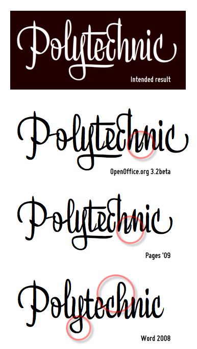
Liza Pro is published by the Underware foundry and their website has an online test page where you can try out the typeface beforehand. Try as I might, I couldn’t replicate those results in any of the common apps I had. I didn’t annotate all the rendering errors in the accompanying image, but among them, OpenOffice and Pages both do a poor job of linking the letters together, and Word simply refuses to create any ligatures.

Going off the foundry’s website, they do include a table of apps known to include contextual alternates (which is apparently the secret sauce that one needs to get this working). Indeed, many of the apps listed there come as little surprise—InDesign, Illustrator, and QuarkXpress all basically work out of the box.

As luck would have it, I have none of those.

I do happen to have Photoshop CS3 (which did make the list), but that’s probably the last app I’d want to use for composing a letter, jotting a note, or anything approaching word processing or desktop publishing. So, at this point, it seems I’m kinda stuck.

To be fair, I don’t consider Underware at fault here; it just so happens that top-to-bottom OpenType support for ligatures & contextual alternates seems relatively sparse within the I-can-afford-this application space at the moment. And it’s not that I have qualms about paying for software—I just don’t have a spare $520 for Illuatrator or $640 for InDesign lying around [sad fontbone].

Bitstream Vera Sans Mono is a Sweet Programming Font

Bitstream Vera Sans Mono — “l” and “0” characters

Since reading on Matt’s site about his opinions on monospace alternatives for coding, I’ve been giving some thought to trying a different font for my editor. The fonts that Matt suggested were “Andale Mono on Windows or Monaco on OS X ”. Windows is still my primary development environment — at least until TextMate gets indented soft wrapping — so I thought I’d check out Andale Mono. As I soon learned, though, it doesn’t come with the OS (apparently it came with IE5, but of course that’s no longer available).

I then came across a gold mine of monospace font alternatives from the TextMate wiki. Looking over the list, my eye was drawn to the Bitstream Vera family, specifically Bitstream Vera Sans Mono. In case you aren't familiar with it, the Bitstream Vera family is a set of 10 fonts that Bitstream released as open source. Many people get to know them as one of the fonts that come with OpenOffice.org or Gnome, but they’re available for anyone to download.

In any case, I tried Bitstream Vera Sans Mono and I’ve been using it ever since. Compared to Courier New (my programming font up until this point), its stroke width is a bit wider (at least how Windows XP’s ClearType interprets it). My favorite characters within the font are probably the lowercase “l” (el) and the number zero (pictured above).

The glyph for “l” has a lovely subtle bend at each end, almost like a backwards “S”. And, as for the zero, it’s differentiated from the letter “O” through a dot in its center. Now, maybe it’s just the nostalgia speaking, but I’ve liked that zero-style ever since the days of playing around on the DOS command line (where I’d see it all the time).

I’d give it a try, if you haven’t already. It’s a free font so you have nothing to lose :).

Update: Ah, it looks like those old Microsoft fonts might just be available after all — maybe I’ll give Andale Mono a try sometime.

ProFont — Monospaced Programming Font

From Joel via MeteFilter’s thread on Arial vs Helvetica, I discovered ProFont, a monospaced font for programming (for Windows, Linux & Mac). Well, not that it’s “only for programming”, but that’s where it may be best suited.

According to his site, Tobias Jung was desperately seeking ProFont for quite some time. It was available on his Mac OS 9.1 box but he couldn’t find a suitable clone for his Windows setup at work. And, to his credit, Tobias doesn’t just wax nostalgic about the font; he also offers some compelling reasons for using it:

  • Slashed zeros
  • Differentiated Is and Ones
  • Distinct punctuation (colons, semicolons, et al)
  • Oversized parenthesis (and presumably brackets as well)

In short, it appears that ProFont has almost all you could ask for in a programming font. My only concern is that, while Tobias cites its small bitmapped nature as a benefit, I might find ProFont a bit tough to read at 1600x1200. Still, I think I’ll give it a chance (If you try it, Joel recommends the FON version, not the TTF version.)

15 Trends in Logo Design

Zeldman points to this article on upcoming trends in logo design (that link points to an introduction while the list itself is on the second page). Most people probably remember the overuse of the swoosh from the late 90s, but most of the trends cited don't annoy me at all.

Though I recognize that many new logos have common themes, the only one that actually gets to me is the “slinky” — and that’s probably because it looks like a designer started with a swoosh and hit Ctrl-V a few too many times. And while the photo-logos are cute (I especially like that orange), I would be concerned with their reproducibility in black-and-white, such as via memo or fax.

My favorite of the categories may be the trend in punctuation (trend #11). But, that could just be the ASCII-art fan in me ;). And, of the punctuation logos, I quite like the one for Workplace Answers — the punctuation there is rather sneaky and I didn’t even notice it at first.