Since reading on Matt’s site about his opinions on monospace alternatives for coding, I’ve been giving some thought to trying a different font for my editor. The fonts that Matt suggested were “Andale Mono on Windows or Monaco on OS X ”. Windows is still my primary development environment — at least until TextMate gets indented soft wrapping — so I thought I’d check out Andale Mono. As I soon learned, though, it doesn’t come with the OS (apparently it came with IE5, but of course that’s no longer available).
I then came across a gold mine of monospace font alternatives from the TextMate wiki. Looking over the list, my eye was drawn to the Bitstream Vera family, specifically Bitstream Vera Sans Mono. In case you aren't familiar with it, the Bitstream Vera family is a set of 10 fonts that Bitstream released as open source. Many people get to know them as one of the fonts that come with OpenOffice.org or Gnome, but they’re available for anyone to download.
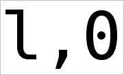
In any case, I tried Bitstream Vera Sans Mono and I’ve been using it ever since. Compared to Courier New (my programming font up until this point), its stroke width is a bit wider (at least how Windows XP’s ClearType interprets it). My favorite characters within the font are probably the lowercase “l” (el) and the number zero (pictured above).
The glyph for “l” has a lovely subtle bend at each end, almost like a backwards “S”. And, as for the zero, it’s differentiated from the letter “O” through a dot in its center. Now, maybe it’s just the nostalgia speaking, but I’ve liked that zero-style ever since the days of playing around on the DOS command line (where I’d see it all the time).
I’d give it a try, if you haven’t already. It’s a free font so you have nothing to lose :).
Update: Ah, it looks like those old Microsoft fonts might just be available after all — maybe I’ll give Andale Mono a try sometime.
Yeah, I’ve been using that font (actually all the Bistream Vera fonts) pretty much exclusively for the past few years. It makes it easier that I’m on Linux and Vera fonts ship with most Linux distros. But I like them so much I think I’d use them even if I were on another OS.
Sorry we missed you Sunday evening.
Hi Jason! Indeed, the Vera fonts are a hidden treasure among free fonts — I only wish I had discovered them sooner.
And I was hoping I could make it on Sunday, but it didn’t work out. I’ve got my fingers crossed for next time.
Whatever happened to ProFont?
http://www.tobias-jung.de/seekingprofont/
I thought that was the gold standard? Slashed zero, visible at 9 pt on my 1400×1050 monitor. PCF and True-type versions.
Josh: Profont isn’t a bad font and it certainly has several programmer-friendly features. However, it’s a bit sterile for my tastes and I wasn’t really able to get used to it :-/.
I vacillate between Monaco and Bistream Vera Sans Mono, both on my iBook at home and on my Windows machine at work. (Somehow I was able to find a TrueType version of Monaco.) Lucida Console is a nice fallback when I’m working on someone else’s Windows machine.
I’ve never understood why Courier, or any other serif monospace font, is so popular. In my experience, the serifs make the code damn near unreadable, especially at low sizes.
Hi there, Andrew! Maybe part of its popularity is that perhaps Courier holds up better on displays which don’t have antialiasing available at smaller font sizes (?).
Prima Sans Mono BT lacks a middle dot in the zero. The Font Aliases file from Ubuntu Linux lacks the Prima Font Families.